Well, Tableau doesn't have a standard 3-D chart type but with some prep work on the data and extending the data densification concepts used to plot curves it is possible to get close.
To start if you are not familiar with data densification, Ken Flerlage has done an outstanding job of presenting the topic in a straight forward and understandable way - see: https://www.flerlagetwins.com/2019/05/intro-to-data-densification.html
To extend those concepts to 3 dimensions think about a cube rotated in space and projection the position of points on the cube back to the 2-D display

Points on the cube are transferred back to the viewing plane using the cube's rotation around the horizontal and vertical axes. There is some math involved and for those who really understand 3D projection, the approach is not a true prospective - just a transfer of point onto a 2D XY plane.
There are a series of calculations that are needed (I will include them here but a downloadable copy of the workbook will be on my Tableau Public site - and you can just copy them from the book) Using Superstore dimensions fore Order Date and Sale and relating them to the X, Y and Z dimensions of the cube:
- Month numbers 1-12 are the X cube axis
- The Sum(Sales) in Thousands are on the Y cube axis
- The Years are the reference on the Z cube axis 2017 = 1, 2018 = 2 etc
Data Structure
After duplicating, data restructuring is needed - In each year (Partition) the original data are sequenced low to high and the copy high to low:
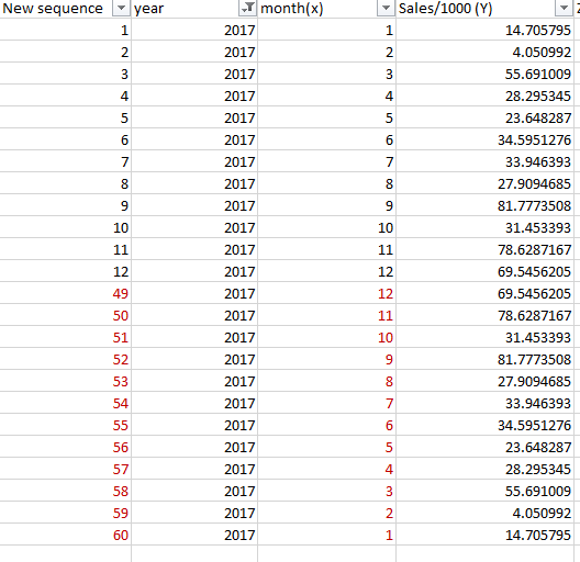
The data are grouped by Year(Order Date) the Z value is just an way to increment the year along the Z axis 1 for 2017, 2 for 2018 etc -
With Tableau Prep the copying, sequencing and restructure the data can be accomplished in a few steps

1- Bring 2 copies of the data - The original file needs no changes - Sequence is from Min X to Max X values
2 - In the Copy - the data Sequence numbering needs to be from the Max X value to Min X
- Determine the Max Z value ( Here 4) : { FIXED :max([Z])}
- Find the Total number of records : {{Fixed Year : Countd([Month(X)]}}

- Renumber the "New Sequence" : (([fix max z]+([Z]-1))*[Fixed LOD1])+(([Fixed LOD1]+1)-[month(x)])
3- Union the files and revise names and remove unneeded columns

4- In the final step convert all the Y values from the copy data set to 0 :
if [Table Names]="Table 1" then [Sales/1000 (Y)] else 0 end
Then output a file for Tableau -
Transformation Formulas
Set up 2 parameters for the rotation around the Horizontal (view X axis) and Vertical (view Y Axis) -

Tableau uses radians, convert the parameter values to radians:
Vertical axis rotation : ([Vertical axis rotation (degrees)]/360)*2*pi()
Horizontal axis rotation : -([Horizontal axis rotation]/360)*2*pi()
Note the negative sign on the horizontal rotation
The transformation of point to the 2D X dimension is
-([Month(X)]*cos([vert axis radians])-(3*[Z])*sin([vert axis radians]))
and for the 2D Y dimension
-(cos([hor axis radians ])*[Sales/1000 (Y)]
-[Month(X)]*sin([vert axis radians])-([z axis gap]*[Z])*cos([vert axis radians]))
Note the Z parameter for the "Z axis gap" is a parameter to adjust the spacing in the final viz.
Create the Viz
The VIZ uses the 2D X and Y calculations on columns and rows - add Z to the detail marks card and Sequence to path -
I include the axis rotation and Z Gap spacing parameters to allow the user to adjust the view

When creating the dashboard I used sheet swapping and added a "Change parameter" set to hover for navigation

Would love to hear from you on this and see what you have done
The sample workbooks can be downloaded from
https://public.tableau.com/profile/jim.dehner#!/vizhome/ThreeDimensionalDisplay/Param3Ddb
https://public.tableau.com/profile/jim.dehner#!/vizhome/ThreeDimensionalDisplay/Param3Ddb
Enjoy
Jim


No comments:
Post a Comment
Note: Only a member of this blog may post a comment.