Monday, January 27, 2020

FAQ Series - Not all NULLS are created equal

My Blog has moved - UPDATED blog post

Not all Nulls are created equal? - Really?

Nulls - they break your calculations and mess with your charts  but why are they difficult to fix?

There are 2  types of nulls each has a different solution

Empty Cell Null

The easiest to understand and to fix is the Empty Cell Null  in your data set.  In this simple data set it is easy to see there is an empty cell (a null) for Cats in the South


When the spreadsheet is loaded into Tableau and viewed on the Data Source tab it is still easy to see there is an empty cell


There is a record for the combination of South and Cats but there is no value in the record. Tableau will interpret it as a Null value -  


The empty cell null value is easy to fix with the ZN() function  (ZN for Zero Null)


No Record Null

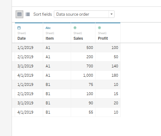
What happens when the data is missing the entire record -  The preferred data structure for Tableau would be a tall and narrow set  like this


Now it is not as easy to see there is no data for South Cats  - This is an example of the second type of Null - the No Record Null - and it can't be fixed with using ZN()


There is no record South/Cats so there is no null value in a record to "zero out"

You can force a 0 in the viz using a lookup function  (NOTE this does NOT create a South /Cats record in the data set)

ifnull(lookup(sum(Quantity),0),0)


You are able to place a value into a view but other functionality is limited.  Lookup is a table calculation performed at the bottom (last) in the Order of Operation.  Table calculations areexecuted after all filters have been applied and all other calculations have been performed - The work on the underlaying table for the worksheet and are only performed at the aggregate level 

Lets see what that means in practice:

Running total is another table calculation and it can be applied to the Fill Null calculation and note that the Grant Total also returns the correct result


likewise Rank_Unique will return the correct Rank for a Fill Null 0


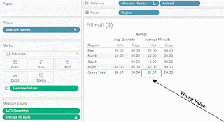
Most users want to total the data using Grand Totals - seems to return the correct value


But see what happens when we try to get an average the results do not meet expectations - averaging the quantity returns 80/3 for 26.7 not the 20 (80/4)  because there are only 3 marks (real records) in the viz-  The total on Fill Null can only be set to Automatic and returns the sum of the records


Using the Average in the "Fill Null" calculation will result in a total that is 26.7 (80/3) again


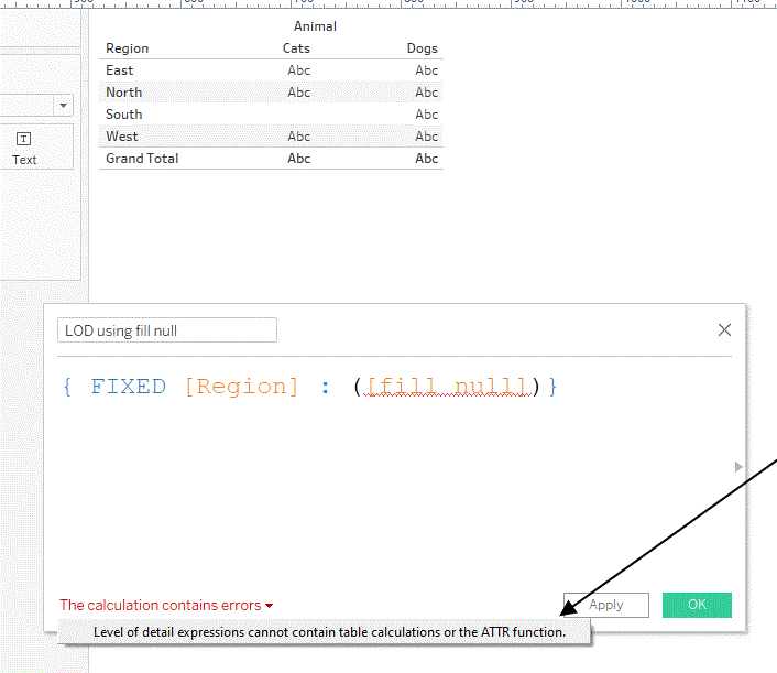
and the Lookup can not be used LOD expressions


and it can't create a record in the data table - Here the table doesn't contain South and Null Fill has no place to put a 0


So using a lookup formula to fill a No Record Null has its limit - What can you do

Padding or Scaffolding

You will need to create a record in the data (think like a cell in excel) that can be addressed with combination of dimensions - here South/Cats - to complete the data set - the technique is referred to a "Padding" or "Scaffolding"

Its not difficult but takes a couple steps - Make a separate file that list the every combination of the dimensions you will need in the analysis - 


Upload the file to Tableau and Left Join it with your data - the missing records are added and the measure value is entered as a "Empty  Cell Null"  - 


The table is now complete and empty cell nulls can be used in any formula using the ZN() function 


ZN fills the cell with a 0 and the value can be used in any type of calculation - here a simple total using average - 


Obviously an elementary examples that illustrate that all nulls are not created equal

The next time you are face with a Null problem - think about which type you have 

If the data table is complete but there is an empty cell  wrap the calculation in ZN() 

If the data table is missing records and
 you need to place a 0 (or other value) in the chart you can use the Lookup table calculation    Ifnull(lookup(sum(measure),0),0)

But if the data set is missing records and you need to use a "No Record Null" cell value in other calculations then Padding or Scaffold is the choice
    I hope it helped you better appreciate Nulls


    Enjoy

    Jim   

    Tuesday, January 21, 2020

    FAQ Series- Cannot Mix Aggregate and Non-aggregate

     Cannot Mix Aggregate and Non-aggregate 

    Look familiar:


    One of the most frequent questions we see on the Forum results from trying mixing aggregate and non-aggregates in the same calculation - But why is that a problem and how do you resolve it -

    Next time you load a data file into Tableau, open the data source tab and spend a moment to look at the data structure.  This might look like a spreadsheet 


    Now, open a worksheet and make a calculation to determine the Profit Percent as Profit / Sales 


    Return to the data source tab and a Column (Measure) has been added to the table with the results of the calculation for each "Row" of data - It's just what we'd expect from a spreadsheet calculator 


    Go to the worksheet and make a viz with totals and subtotals.  Whats going on? The row profit percents are correct but the totals and subtotals are wrong


    Tableau aggregates measures as they are brought to the viz so the individual profit percents are summed in the viz - the problem started with the calculation - Sales and Profit need to be aggregated in the calculation


    Now on the Data Source tab the Aggregate Profit Percent look just like the Simple values


    But when we add the new measure to the viz we get the correct totals and subtotals
    Note also the measure is brought to the viz as and (AGG)regate


    So you can see how using aggregation in a calculation will affect the result but it is also the source of the aggregate - non-aggregate problem.  


    The message simply means that if one dimension or measure is aggregated in a calculation then ALL the measures and dimensions in the calculation must be aggregated 


    - But sometimes it is not easy to see which dimension or measures need to be aggregated.  See the following examples:

    1-Table Calculations

    Table calculations are aggregations so other measures in the calculation need to be aggregate too - here Difference is a table calculation so Sales needs to be aggregated :


    Aggregating Sales with Sum() solves the problem 


    2-Embedded Dates

    Often dates are embedded in a calculation that includes an aggregation - 


    Here Sales in aggregated so Order Date and Ship Date need to be aggregated - Wait aggregate Dates - sure Dates and string (text) dimension can be aggregate with Attr(), Min() or Max() - your choice will depend on the analysis you are doing

    This is just one way around the problem


    Note: removing the sum() from sales would also work

    3 Aggregations cause by LOD's

    Sometimes, dimensions within an LOD cause the problem - The argument in an LOD must be aggregated - here Sales is aggregated but Category is not 


    There are 2 solutions - the first is use a Min() or Max to aggregate the Category (Note:  Attr() can not be used in an LOD)


    The second is to move the Sum() outside the conditional statement in the LOD


    Either solution will work

    4 Using an LOD to resolve an aggregation problem

    This example calculates the COGS percent to Sales
    determine  COGS:


    But it results in an error when used to calculate the percent to Sales


    LODs create a virtual layer in you data set that is at a different level than the data itself BUT they are not an aggregate.   To correct the error aggregate the LOD


    5 Value at Max Date

    A common question is to find the value on the last date - there are 2 ways - My preferred is using an LOD to find the last date in the data for each sub-category


    Then the sales value on that date is 


    But it returns and error because the Sales are aggregated but neither the order date nor the LOD are - so a solution would be to aggregate the date and the LOD - here I used Min 


    An alternative would be to use a table calculation (here Last()) but it also returns an error


    Which can be resolved by aggregating Sales


    Process to Identify the Aggregate

    There could be many more examples and still not get to the one you has you stumped - Fortunately there is an easy way to know which of the dimensions or measure in your calculation are aggregated and which are not - 
    • Open the calculation and drag the measures to the Marks card - 
    • IF the show up with an AGG() then they are already aggregates - 
    • If Tableau tried to aggregate them with SUM()  then they are not aggregated and you will need to decide which aggregation best fits your analysis


    Hope this helps - If you have specific examples where you need some help feel free to ping me here or add a post to the Forum

    Enjoy
    Jim

    Tuesday, January 7, 2020

    Put life in your Viz with Set and Parameter actions and Viz in Tooltip

    Set and Parameter Actions and Viz In Tooltip


    Add life to your vizzes and make it easier on the user by using set and parameter actions and viz in tooltip


    Set Actions

    Set actions added to the dashboard are an easy to use alternative to drop down filter. In the dashboard below - the map provides a visual way for users to select the state or regions to be included in the YoY and subcategory Ranking  


    Create a set on State - use select All - the set action will change that later


    For use in the YoY and Ranking worksheet  you will need a parameter for the end year -  (Note for this example I just used full year sales - the approach will work with YTD sales also) 


    Then LODs for current and prior year sales are needed (Note I included Segment for use in the viz):
    Current Year:

    { FIXED [Segment] :sum({ FIXED [Order Date],[Segment],[State]:zn((
    if year(min([Order Date]))=([3 Enter end year]) and MAX([3 select state for rank])
    then sum([Sales]) end ))}  )}

    Prior Year:
    { FIXED [Segment] :sum({ FIXED [Order Date],[Segment],[State]:zn((
    if year(min([Order Date]))=([3 Enter end year]-1) and MAX([3 select state for rank])
    then sum([Sales]) end ))} )}

    And YoY sales growth is  are:

    (sum([3 TY Sales])-sum([3 LY Sales]))/sum([3 LY Sales])

    Add an LOD to rank the subcategories
    { FIXED  year([Order Date]),[Sub-Category],[3 select state for rank]:
    sum(if [3 select state for rank] and year([Order Date])=[3 Enter end year]  then [Sales]end )}

    An finally Rank the subcategories using

    RANK_UNIQUE(sum([3 LOD sales by state for rank]),'desc')
    and a filter
    [3 rank states ]<= [3 N for top N]

    Create 3 worksheets:
    YoY Growth by Market Segments:


       Subcategory Rank


    and the Map is a simple filled map


    Then bring the together on a dashboard


    Add a set action to the Map to change the State Set based on a visual selection from the dashboard


    And the User can now select states or regions directly from the map and the YoY growth and subcategory ranking will adjust accordingly - 


    Parameter Actions 

    Parameter actions work just like set actions except parameters are single valued and allow users to select that value visually from a value picket on the dashboard -

    Using the same model as above add a value picker and a parameter action to change the Select End Date Parameter.  You can be more elaborate - I just used a simple square chart on a worksheet to make the Value Picker


    Add the Value Picker and a Parameter action to the dashboard


    and you are done: 


    That's only scratching the surface of using set and parameter actions to replace drop down menus - have some fun with them and see - you can't break anything-

    Viz in Tooltip 

    When Viz in tooltip was introduced in 10.5,  it was interesting but I didn't realize that it was a such game changer - 

    If you haven't used them, Viz in tooltip is a function that will bring an image of the filtered results from another worksheet into the tool tip when the user hovers or click on a mark.  It works like a filter action passing dimension values from the first sheet to the second then returns an image (note:  a PNG that is not interactive) to the tooltip.  

    Lets see how it works

    Create 2 sheets - the first a simple sales by category bar chart


    and a profit map 


    The goal is to show the filtered profit map when hovering over a segment on the bar chart.  Open the tootip tile, then select Insert, then Sheet - then select the sheet you want 


    And it returns this


    Let's see what is going on  - when you set up the tootip, Tableau first added a text string into the tooltip


    The sheet name is in quotations, the max width and height are the size of the image in the tool - you can overwrite the value to resize the image as needed and the dimensions to be filtered on the second sheet - Here All Dimensions from the first sheet are applied to the second sheet (Map) before the image is returned -  You specify field you want filtered as shown


    Tableau also creates an action filter on the second sheet (Map) based on the filters passed


    That was easy - I've used Viz in tooltip as shown, to bring back the next lower level data from a hierarchy and like a lookup function to bring back specific information on a specific item from a long detailed text table (only the detail table is ugly but I am the only one who sees it - the user just sees the filtered data)

    This year at TC19 there was a presentation that took Viz in Tooltip to a totally different level.  If you weren't fortunate enough to see Jade Le Van's presentation live, see the recording at https://tc19.tableau.com/learn/sessions/next-level-viz-tooltip#recording - It is an hour well spent.

    The 2 examples that follow were derived from her presentation - Only hope to do them justice 

    First - the "Dashboard in Tooltip"  - is not literally copy a dashboard in the tooltip but building one from several worksheets.  

    Three worksheets - Sales, Top N and Sales Growth are going go be added ion a single tooltip


    The 3 worksheets are inserted in the tooltip as before - a blank sheet is added to draw a line to separate the views (you will to copy and paste the text)


    Hovering over a state applies filters to 3 worksheet and brings the results to the tooltip -


    The last example shows how to see one view in the tooltip on hover but something entirely different when the marked is "clicked"   - it is requires several calculations and filters 

    Hover returns this


    Selecting a state with a click returns this:


    Hover does not select a state so the count of all states in the view is 49 (Sorry Alaska). Selecting a state with a click reduces the number to 1 - so we can use a distinct count of states across the view (Window_count) to determine the view we want to see

    If the Boolean below is True - we want to see the Pie Chart - if False we want the Line Chart

    Window_sum(countd([State]))=1

    Tooltips don't accept calculations - but this will "Sheet Swap" based on the state count

    CASE [1 window sum countd state tf] 

    when TRUE then '<Sheet name="percent total pie" maxwidth="300" maxheight="300" filter="<All Fields>">'

    when FALSE then '<Sheet name="annual profit" maxwidth="500" maxheight="500" filter="<All Fields>">'end

    Just need one more thing - hovering does not select a single state - there are still 49 states in the view.  We need to pass a single state to the Annual Profit sheet  - for that we need a set and set action 

    Create a set


    and a set action


    Then create the viz


    On the Profit sheet add a set action filter


    On the Map apply the click action to the Pie chart only


    And you are done


    Fee free to download it an use it as a model

    Enjoy

    Jim

    Post splash image

    My Blog Has Moved