Thursday, December 5, 2019

Dynamically sort Top N in a Drill Down Hierarchy

My blog has moved to jimdehner.com 

Thank you for all the support over the past 2 years - I recently updated my blog to make it easier to read, improve the rendering of images and tie back to video presentations that are associated with the content - Check it out at  Jim's new blog  -   


Dynamically sort Top N in a Drill Down Hierarchy

Lately the Forum has been peppered with questions about sorting, ranking, application of filters and how to make the sort “Dynamic”.  So I thought I would take some time to go through a few examples on how to sort in most situations

By combining LOD’s with a ranking table calculation it is possible to dynamically sort in a drill down hierarchy


But let’s start at the beginning with examples to show how sorting works and how it will interact with the Order of Operations

Note: The post use Superstore data – Sales at the Region and State level and Year of Order Date I also have a Top N State Parameter set to 5 - 

Example #1 - Basic single level sort

A simple sort of Sales by State 


States are sorted on the sum(Sales) descending (max to min) – no problem

Example #2Nested Sort

Add Region and by using the sort Icon on Sales Tableau sort max to min within each region


Now let's add filtering

Example #3Top N filter

First, try to put in a Top N filter on State


But even with Region in the view Tableau returns 5 States not 5 State per region


A look at the Tableau Order of Operations shows why


Top N filters (the type applied on the Filter menu) are calculated after Context filter and in the same step as Fixed LOD expressions.  Both precede Dimension and Measure filters 

– the Top 5 States are determined before the Regions are applied – and Tableau returns the Top 5 States overall


What can you do?: - 

Example #4 - Sort by Rank 

Rank can be used in a filter   
– This calculation ranks the sum of sales by the filtered dimensions in the view – max to min 
- if the rank is less than the Top N State parameter (5) it returns a True

            RANK_UNIQUE(sum([Sales]),"desc")<=[Top N state]

Tell Tableau to determine the Rank by State


(Just my POV – I prefer Rank in one of its many forms – Rank works with any aggregation, LOD’s or can be nested with other Table Calculations)

Create the viz. Tableau returns this


Example #5 LOD sales and Rank filter

The same result could be used using an LOD on sales and rank on the LOD

                        Fixed State Year Sales = { FIXED [State],year([Order Date]):sum([Sales])}

Add a filter  Rank on Fixed State Year

  RANK_UNIQUE(sum([Fixed state year region sales ]),'desc')  <=[Top N state]

It returns the same viz


The advantage of using the LOD becomes apparent when the user wants to see the yearly breakdown – With Year(order date) in the LOD the viz will adjust to the filter present the rankings by year


Example #6 - Top 5 States by region by their percent to total sales within the region


By now I hope you know that using a Table Calculation and Top N filter on State will not return the result you want -  but just in case

This is the formula for the Percent of Total table calculation

                                SUM([Sales]) / TOTAL(SUM([Sales]))

And when it is set to restart ever Region and the state filter is set to Top N


By using the LOD Equivalent of the percent of total

SUM([Fixed state year region sales ]) / sum({ FIXED year([Order Date]),[Region]:sum([Sales])})

and a Rank Filter around the LOD

[rank percent lod]<=[Top N state]

The Viz would look like this


The solution can be extended to multiple years


Example #7 - Sorting in a drill-down hierarchy 


The example uses the Product Hierarchy from Superstore

                Category→Subcategory→Manufacturer→Product Name

The LOD to calculate sales within the hierarchy uses the Include form of the LOD

                                { INCLUDE [Product Name]:sum([Sales])}

And the Ranking filter is (Note I added a Top N Product parameter)

                RANK_UNIQUE(sum([Inlcude lod hierarchy]),'desc') <= [Top N Product]

I also added a color code based on the Rank 

Create the viz drag the hierarchy to Rows and fully extend it to Product Name 

Set the hierarchy members to sort descending 

  • Open the Pill and select Sort and set to Nested – Descending 
  • Sort on Sales use the LOD as the formula 
  •  Repeat the same at each of the other levels in the hierarchy

Set the two Rank table calculations to calculate Pane Across


At the highest level in the hierarchy there are only 3 categories in the view


Expanded to the lowest level - Each level will have a max of 5 (top N Product =5) values sorted max to min


Example #8  Drill-Down hierarchy including date

I spent a lot of years in product manager in consumer products companies – One question that came up around the end of the year which state contributed the most to sales and how had that changed in recent years 

For the example I created a separate hierarchy

                Region→ Year(Order Date)→State   - WaitOrder Date between Region and State??

Yes, you can create a hierarchy on dimensions that seem counter intuitive and use it in the drill down-

 
The formula for order date is simply
Year(Order Date)


The LOD used to aggregate sales is

                { INCLUDE  [State],year([Order Date]),[Region]:sum([Sales])}

And the rank filter  is just

                RANK_UNIQUE(sum([Fixed state year region sales ]),'desc')  <=[Top N state]

 Create viz - Drag the Hierarchy to Columns and set the filter to True


At the year level results are sequenced by Year within Region
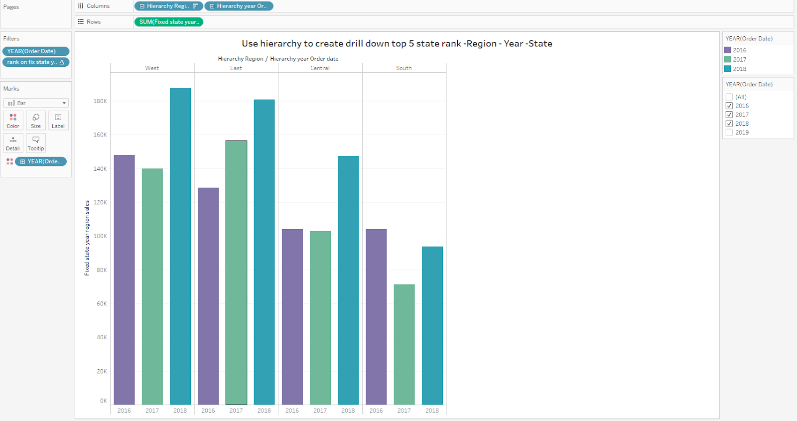


Drill down to State and the Top 5 States are ranked  by Region and Year


The workbook containing the examples can be downloaded from my Tableau Public site at 


Hope you now understand sorting and you are ready to take your viz to the next level

Jim


Monday, December 2, 2019

Use a scaffold to solve the 2 date problem

My blog has moved to jimdehner.com 

Thank you for all the support over the past 2 years - I recently updated my blog to make it easier to read, improve the rendering of images and tie back to video presentations that are associated with the content - Check it out at  Jim's new blog  -   


The most frequently viewed workbook on my Tableau Public site is a solution to the classic 2 date problem.   –  The data have only a start and end date and you need to know how many programs are active on any date – Ultimately you want something like this


The business question can take many forms
  •        Head count given only a hire and termination date
  •        Account balance given deposit and withdrawal dates
  •        Count of active (or inactive) customers

The file may look like this


But dates cannot be aligned along a single axis


To count the “active programs” we need a data structure where the account start date and end date can be aligned along a common axis


One solution is to create a date file – or scaffold – and attach the detail account data to the scaffold

The scaffold is a simple file of consecutive dates from the earliest date in our data to a minimum of the maximum date (or extended to include future date)


Load the scaffold into Tableau and join it to the detail data set.  Every record in the detail data has to join with each date on the scaffold –


Here is how it is done:

On the data source tab add the Date Scaffold and drag it to the canvas

Join the date scaffold and the detail file with a join clause of 1 = 1


Every record in the detail file is now connected to each date


The start and end dates are aligned with each date on the data scaffold

Add an expression that will count the dates from the date ladder that are between the start and end date

{ FIXED [Account ID],[Scaffold Date]: if min([Scaffold Date])>=min([Start Date]) and min([Scaffold Date])<max([End date]) then 1 end   }

And create the viz


The actual workbook with How To Instructions can be downloaded from the Tableau Public site at https://public.tableau.com/profile/jim.dehner#!/vizhome/Scaffold-2dateexamplev10_5/Overview

It is in a Tableau 10.5 format for your convenience - enjoy


Jim

Saturday, November 30, 2019

More than dots on a map - The renewable energy story

My blog has moved to jimdehner.com 

Thank you for all the support over the past 2 years - I recently updated my blog to make it easier to read, improve the rendering of images and tie back to video presentations that are associated with the content - Check it out at  Jim's new blog  -   


Renewable Energy – How big is it-


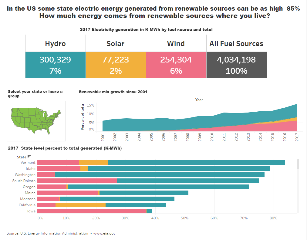
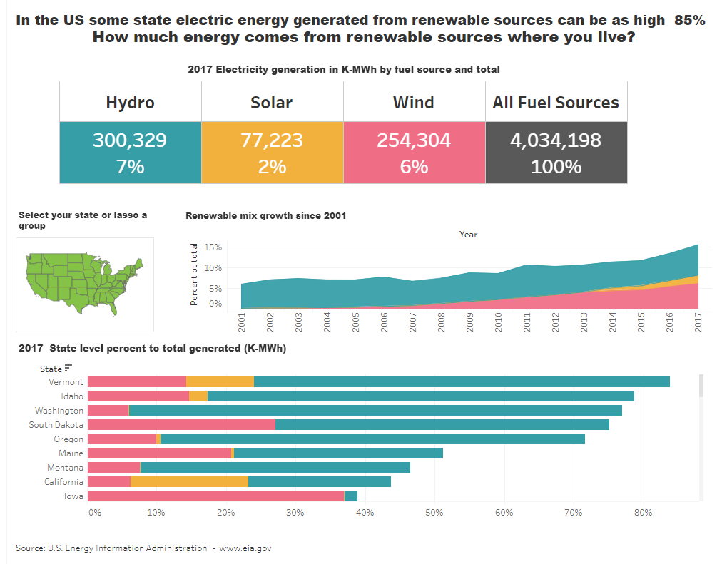
A dashboard should tell a story beyond just presenting data.  It needs to be interesting and when possible encourage the viewer to interact and investigate to make the story their own. This is the end product


But that's several iterations later -

It  started like this - as a result of a trip from Nashville to Chicago. In northern Indiana there was a 10 mile stretch  where as far as I could see to the east or the west all I saw were wind turbines. Wow – didn’t expect to see that – thought that wind power was just a west coast thing.  

I found a data set that includes the location of every wind turbine in the US -  They were concentrated in the mid-west and south  Not what I expected at all - I had a lot to learn!


While interesting there wasn't much of have a story from that data  – just raised a lot of questions – How much energy do wind turbines produce? Is it a significant portion of overall energy production? What about other renewable sources? How does it vary by state?


What would you do - something like this might work but how would you make that


To start you need data. Lots of data! – Energy generated in Kwh , by generation source at the state level – you could use a search engine and hope for the best – there are also several portals that you could consider

The energy data used in here was found at www.eia.gov the US Energy Information Agency site but each energy source had to be extracted separately – (the a future post will go through the Tableau Prep flow used to combine and clean the separate energy source files). (Note: data is for electric energy generation in 2017) 


But what's the story? – Does energy generated from renewable source really represent 10% of the total?  That’s what I thought before looking at the data but that’s just not right – nationally it is closer to 15% and it some states renewable energy sources can account to 85% of the total. 


  • the portion of energy generated from each of the renewable source in each state
  • the state rank nationally 
  • and the trend since the start of the century

That would be a much more interesting story that just the location of  wind turbines that got my initial interest.   It would also be good if the dashboard was dynamic so individual users could look at their state or region.

The upper portion of the viz is where you can create the  most impact – Make the title a statement that takes the user away from any preconceived notions and use BAN blocks present both present the facts and set the color code for the rest of the viz


The block color – teal for Hydro, Gold for Solar, Red for Wind and Black to total all sources will be used throughout the remaining charts

Now build on the story including a Trend chart to show growth since the start of the century and  a state level ranking chart to see a comparison throughout the area.  They are relatively straight forward area and bar charts using the percent of total calculation


Finally, allow the user to select a state or area and change all the charts accordingly –
That’s the fun part and you may have noticed references to sets in the previous charts -


Sets and set actions driven off a state map make the dashboard dynamic. 
To create the State set, Open the STATE pill and Select CREATE then SET


When the box opens Select any STATE – we are going to change it with a set action, so the initial value is not important


Next create a simple Map at the State level
Drag State to the canvas to create the map and be sure to place the State Set on the marks card


Bring it all together on a dashboard using containers to fix the location of the individual sheets


Make your point in the title and always include attributions for data sources, functions or material that are not your own.  Also, if you want the user to do something you need to tell them what to do and why

One last thing – need to make the dashboard dynamic by adding a set action
And then set the action to go from the map on the selection form the viz


on the individual worksheets set action filter has been added


The filter is set as IN meaning that the States selected from the Map will be applied as the filter – you can select a single state, or several using a Cntl Select or use the lasso to select a area
  
Congratulations – you’re done!


Download the actual workbook, complete with  “How To” instructions, from my Tableau Public site at https://public.tableau.com/profile/jim.dehner#!/vizhome/RenewableEnergySources/Dashboard1 


Jim

Post splash image

My Blog Has Moved